Ezo
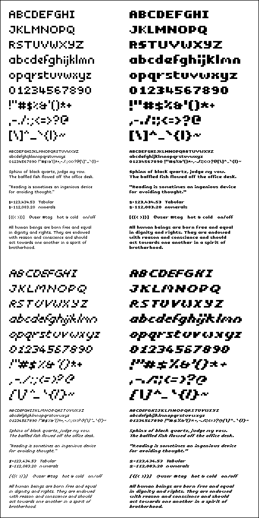
When considering user interface designs that scale down to the smallest dimensions, it becomes essential to have a typeface that provides a good trade-off between character density and readability. The Ezo typeface was designed to meet that objective.
Features
- An extremely small font for low density displays.
- Two font weights: bold and regular.
- Italic styles for both weights.
- Open, and consistent character shapes for readability.
- Kerning rules to maximize character density.
- Covers the printable ASCII character set.
The typeface has already been released as an open source library which also features:
- Algorithmic underlining of text.
- Adjustable inter-word spacing.
- A small library with no dependencies.
- Custom plotting allows any mode of rendering to be supported.
- A fluent, simple API.
Sampler